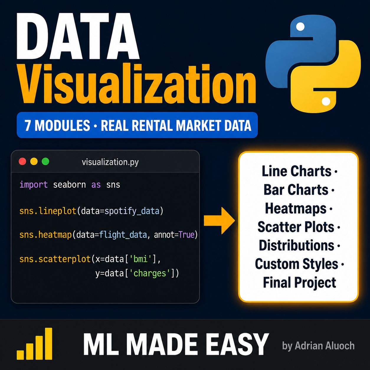
Python for Data Visualization: Build Charts on Real Data

Data visualization is the difference between numbers nobody reads and insights that actually change decisions, and most analysts can run the code but few can tell the story.
This course teaches you how to create clear, meaningful visualizations in Python using Seaborn, one of the most powerful visualization libraries available, taking you from your first chart to building a complete visual analysis on real Nairobi rental market data by the end.
By the end of this course you will have:
- Created your first visualization using Seaborn
- Built line charts to show trends over time
- Created bar charts and heatmaps to compare categories
- Used scatter plots to explore relationships between variables
- Plotted distributions to understand how data is spread
- Chosen the right chart type for any situation
- Completed hands-on exercises after every topic
- Built a final project visualizing real Nairobi rental market data
Each topic has a hands-on exercise notebook so you practice immediately after learning.
No prior visualization experience is needed, basic Python knowledge is enough to get started, and everything runs offline on your own machine with no subscriptions, no cloud setup, and no hidden costs.
This is not a course about making pretty charts. It is about telling the truth with data.