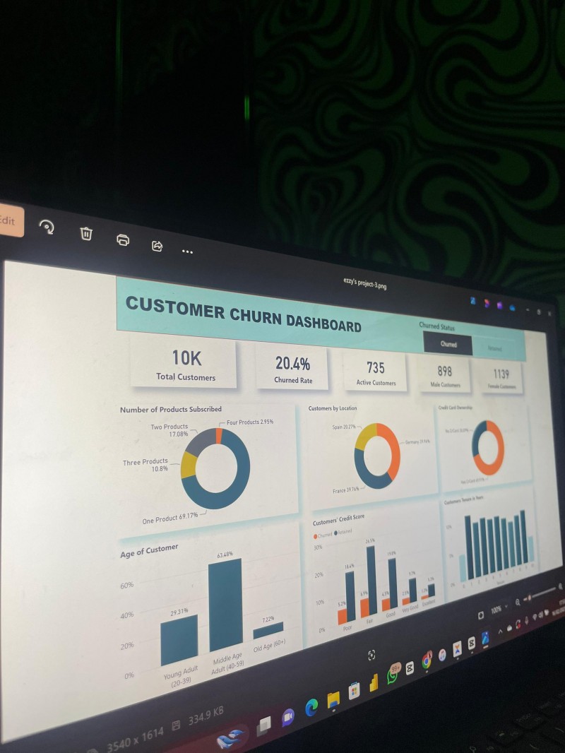
Dashboard Design Like a Pro
Tired of dashboards that look messy, confusing, or just... boring?
This course will teach you how to build clean, beautiful, and effective dashboards using timeless design principles. This course is NOT about learning just Power BI, Excel, or Google Sheets — it’s about learning how to design dashboards that work. Whether you're using Power BI, Excel, Tableau, or even Canva, the design principles you’ll learn here apply everywhere.
What You’ll Learn
✅ The core principles behind great dashboard design
✅ How to choose visuals that actually tell a story
✅ Color, layout, and UX tricks that professionals use
✅ Hands-on practice with real-world dashboard examples
✅ My personal Power BI walkthroughs — tool shown, principles universal
✅ How to present your dashboard like a pro
Who Is This For?
This course is perfect for:
- Data newbies who want to stand out with beautiful dashboards
- Analysts and business pros tired of basic, cluttered reports
- Anyone using Excel, Power BI, Google Sheets, Tableau, or other tools
- Freelancers or job seekers wanting portfolio-ready dashboards
What You’ll Get Inside
🎥 Step-by-Step Video Lessons
Self-paced tutorials breaking down dashboard design fundamentals you can apply in any tool.
📁 Real-Life Dashboard Projects
Practice dashboards based on real-world scenarios to help build your confidence and portfolio.
🧠 Dashboard Glow-Up Coaching (2–3 Calls)
One-on-one Zoom sessions with me where I’ll personally review your dashboards, answer questions, and guide your design improvements.
🎁 BONUSES
- ✔️ Premium Dashboard Template Pack
- ✔️ Dashboard UI & Color Style Guide (PDF)
- ✔️ Optional: Private Telegram/WhatsApp support group
Why This Course Is Different
Most courses just teach you how to use a tool.
This one teaches you how to think like a dashboard designer.
You’ll walk away not just with technical know-how, but with the skill to create dashboards that tell powerful stories.
💰 Pricing & Limited-Time Offer
🚀 Launch Offer: Only ₦20,000 / $20
Get access to the full course, real-world projects, dashboard templates, a visual style guide — plus 2–3 private one-on-one coaching sessions with me to review your work and answer your questions.
Just one private session like this would normally cost more than ₦15,000 — but for this early launch, you're getting the complete package for only ₦20,000.
🎁 Bonus: All early-bird signups get a FREE dashboard template pack and access to a private support group (optional).